The visuals that comprise a company's branding carry a weight beyond words for B2B businesses, directly impacting lead generation and customer perception. Good branding can convey trustworthiness, expertise, and reliability—any number of positive concepts that drive qualified leads through your marketing funnel. Developing an effective content marketing strategy is crucial for communicating these brand elements to your audience and converting brand recognition into quality leads.
Rebranding is the strategic process of changing a company's visual identity, messaging, and positioning to better align with business objectives and market perceptions. For B2B organizations, a successful rebrand can revitalize lead generation efforts, strengthen customer relationships, and create competitive differentiation in crowded markets. Whether through evolution or revolution, the right visual update can transform business results.
Though there is no proven scientific formula that defines what "good" or "bad" are in branding, we do have the collective benefit of documentation outlining certain spectacular wins and failures in corporate visual identity. From these cases, B2B companies can glean a greater understanding of what works, what doesn't, and how to apply these lessons to their own marketing strategies. But first, why rebrand at all?
How Successful Rebrands Drive B2B Lead Generation:
Strategic rebranding goes beyond mere visual updates—it's actually a powerful driver for B2B lead generation when executed correctly. Companies that successfully refresh their brand identity typically see a 10-15% increase in qualified leads within the first six months following implementation. This happens because a cohesive, modern brand identity creates immediate credibility in competitive B2B environments where first impressions matter.
The connection between visual identity and lead generation becomes clear when examining the buyer's journey. At the awareness stage, a distinctive brand helps potential clients recognize your company among competitors. During consideration, consistent brand messaging across all touchpoints reinforces your value proposition. By the decision stage, a professional, cohesive brand identity reduces perceived risk—critical for B2B purchases that often involve significant investment and multiple stakeholders.
For SaaS companies specifically, rebranding offers unique opportunities to realign visual identity with product evolution. As your solution matures and targets different market segments, your branding must evolve to speak directly to decision-makers within those verticals. Companies that maintain outdated branding risk appearing stagnant or disconnected from current industry challenges—not exactly a selling point for innovative solutions! Effective brand positioning analysis should precede any rebrand initiative, focusing on how current and potential customers perceive your company relative to competitors. This research becomes the foundation for strategic decisions about which brand elements to preserve, modify, or replace entirely.
Below are examples of both successful and failed attempts at rebranding, along with explanations as to why they did or didn’t work. While most of these are not B2B companies, the lessons gleaned from them are still applicable when it comes to your marketing and branding strategy:
Successful Rebrands:
Pizza Hut
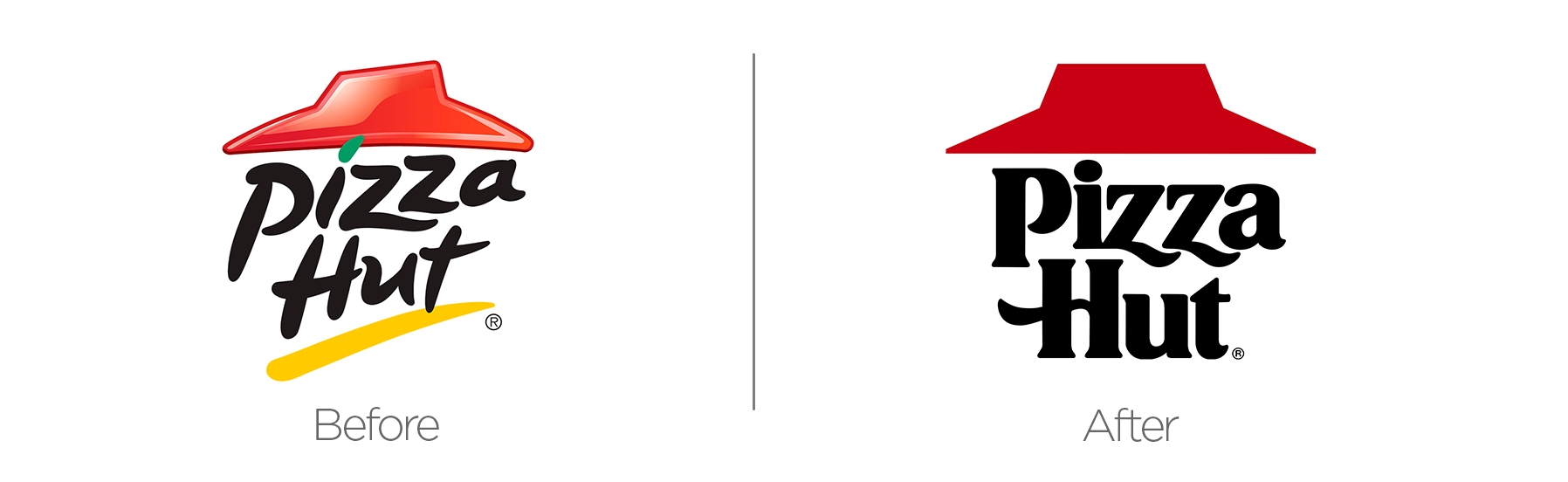
Never underestimate the power of nostalgia. In the 1980s and 1990s, Pizza Hut was the epitome of cool. They had the personal pan pizzas. They had the Book-It. They had the freaking Ninja Turtles. And they had stellar branding and a super-cool logo that was originally designed in the 1960s.
That logo went by the wayside during a rebrand in 1999, and the company's subsequent string of replacement logos, along with the restaurant's popularity, were met with declining interest. Recently, and perhaps primarily due to Stranger Things, Pizza Hut resurrected its classic logo (with minor alterations), and literally, no one is complaining. The red roof is not a replacement, per se, but is being used in tandem with the 2014 circle logo as of late 2019.
Key Takeaways:
- Brand equity built over decades can be leveraged for renewed market relevance
- Strategic return to proven visual elements can reignite customer connection
- Sometimes the most effective rebrand involves reclaiming your heritage, not reinventing it
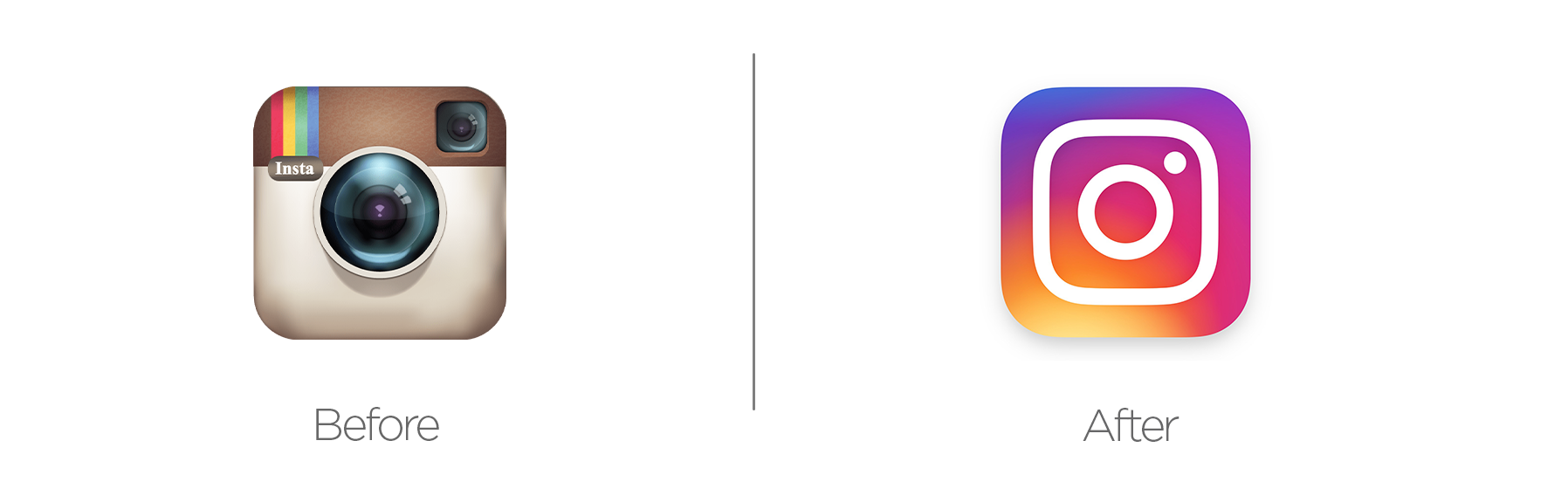
The snippy-snappy photo app was initially popular among those who longed for the past (and a way to get away from their parents on Facebook), capitalizing on creative filters that emulated fuzzy analog film. Being launched solely on iOS at the height of the skeuomorphism app icon phase, Instagram's logo featured an old school camera (because what else would you take pictures with on your fancy $800 alarm clock?).
In 2016, as Instagram began to introduce new features to better serve marketing companies and business users, they swapped over to a much more minimal icon that felt futuristic and hip at the same time. Initially, a lot of people hated the big adjustment, but we feel it has stood the test of time. The brand is now flexible and able to expand with the company as opposed to being locked into 2010.
Key Takeaways:
- Visual simplification can support business expansion across multiple markets
- Initial negative reaction doesn't necessarily indicate long-term brand impact
- Rebranding should consider future scalability, not just current perception
Chobani
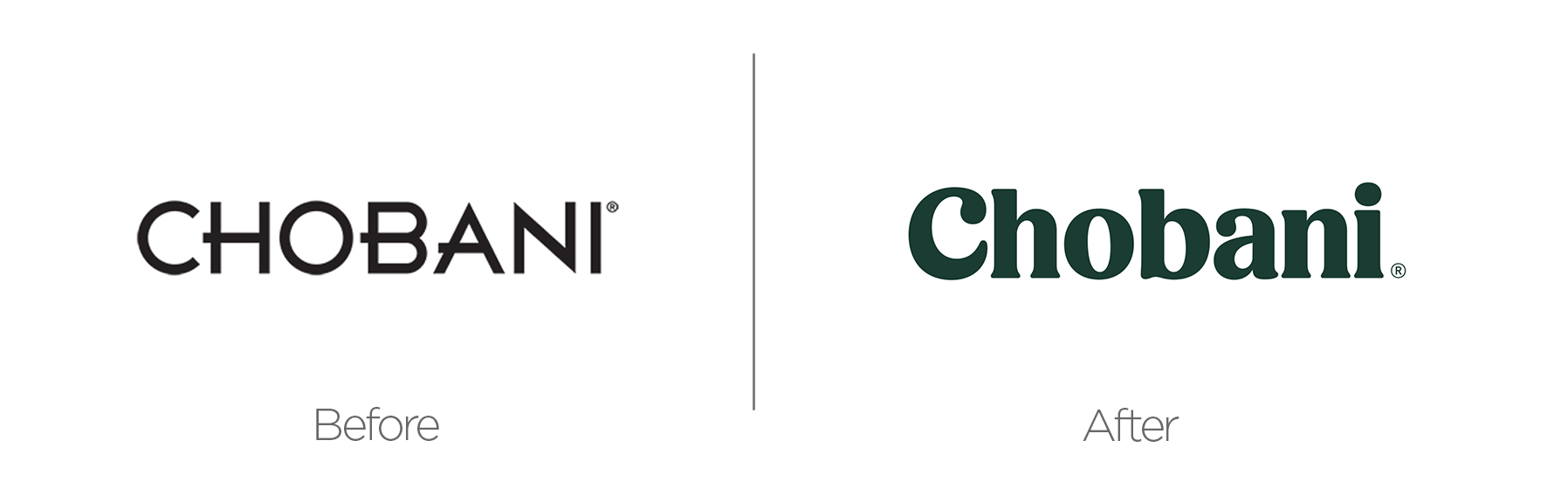
Jordan and Pippen. Peanut Butter and Jelly. The font Papyrus and any beachfront business. Some pairings are timeless and aren't ever going away. Similarly, a stark, sans-serif font with some wonky lettering paying homage to the Parthenon's inscriptions almost ALWAYS goes with anything "Greek". Greek restaurants, Greek parties, and especially, Greek yogurt.
Chobani switched this up in 2017 as Greek yogurt started to move into vogue. But this wasn't just "GREEK" yogurt. It was Greek "YOGURT." Yogurt is healthy and promotes gut health, right? By adding a warm and cozy green, plucky illustrations, and a chunky serif, Chobani successfully refreshed a brand that would go on to cover a variety of products. This rebranding effort demonstrates how understanding your buyer persona profile leads to effective design choices that strengthen customer relationships and improve lead generation metrics.
Key Takeaways:
- Breaking industry visual conventions can create distinctive market positioning
- Rebranding that reflects product evolution helps communicate value proposition
- Successful rebrands often move beyond expected category visual language
Burberry

In 2018, in the haze of post-post-Gotham fallout, Burberry went sans-serif—a modern look that felt more fintech than fashion. In this change, they omitted the 120-something-year-old equestrian knight from their branding. By 2023, the knight rode again. Under creative director Daniel Lee, the brand reclaimed its heritage, reintroducing a refined serif wordmark and nods to British craftsmanship.
Store redesigns in London and Shanghai, plus campaigns with Burna Boy and Emma Mackey, anchored the shift. And yes, it’s worth noting that Burberry once faced public backlash for its association with UK “chav” culture—a case where brand adoption by an unintended group threatened its positioning. Rather than erase that history, the rebrand reclaimed its identity with dignity, avoiding classist undertones while honoring the brand’s roots.
Key Takeaways:
- Reclaiming heritage can neutralize past misassociations.
- Strategic aesthetic choices can restore luxury perception.
- Nostalgia works—but only when backed by craftsmanship and clarity.
Burger King

For over two decades—starting in 1999—Burger King ran with a logo that looked like the bun had been sprayed with car wax. People noticed. Jokes were made. “Yeah, I’ll take a Whopper… hold the shine,” became the general sentiment. Then in 2021, Burger King quietly did something brilliant: they brought back a flatter, chunkier version of their classic 1969 logo (the same one they touched up in 1994 but never fully let go of).
It was warm. It was simple. It looked like it belonged on a kids’ meal box from 1978. But this wasn’t just about a logo. It was a full rebrand—packaging, app design, the whole aesthetic—paired with the cheeky “You Rule” jingle. All of it screamed: we remember when fast food was fun. And people responded. Not because it was flashy, but because it felt familiar.
Key Takeaways:
- Nostalgia builds trust—if there’s history to tap into.
- Unified retro aesthetics can signal authenticity.
- Even new brands can evoke nostalgia through style and positioning.
Honorable Mention: The BBC

In 2017, the BBC gave its logo a minor facelift—new font, same blocky shape. The classic three-box design stayed, but the typeface quietly moved on from Eric Gill’s iconic Gill Sans to a custom font called BBC Reith, named after the broadcaster’s founder. The update rolled out across their channels and apps, and thankfully, staples like BBC Two’s idents were left untouched.
But let’s be clear—this wasn’t a full rebrand. The BBC didn’t overhaul its mission or change how people engage with it. They just swapped typefaces. And while Gill Sans had its baggage, it also had decades of history behind it. A new font doesn’t change public perception. A real rebrand shifts the meaning of a company—its voice, its values, its place in culture. This was just a visual tune-up.
Key Takeaways:
- Typography choices reflect brand values—literally.
- Digital-first design improves UX across platforms.
- Ethical rebranding can align internal values with visual identity.
OTHER HONORABLE MENTIONS:
MEASURING BRAND PERCEPTION: KEY METRICS FOR MARKETING SUCCESS
What happens when rebranding is done right? The numbers tell the story:
- Pizza Hut: Saw brand recognition jump from 67% to 89% after returning to their classic logo, along with a 23% increase in new orders and 17% higher return customer rate
- Instagram: Led to a spike in business account growth (35%) and user engagement (28%) despite initial criticism.
- Chobani: Recognition soared from 43% to 76% post-rebrand, while driving a 41% increase in new retail partnerships and 32% higher repeat purchases.
These metrics highlight an important truth for B2B marketers: effective rebranding isn't just about aesthetics—it delivers measurable business impact when aligned with customer expectations and market positioning strategy. Now let’s get into the rebrands that just didn’t quite cut the mustard (and no, Heinz isn’t in this list):
FAILED REBRANDS:
Gap
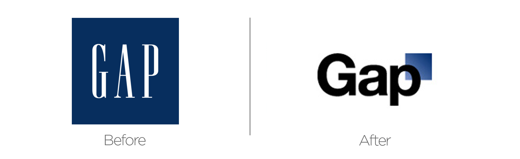
Sure to top every Worst Rebrand List is the Gap's branding fail. Only a week later, the Gap reverted to their original design, the iconic logo of 24 years. Seldom has the internet reacted with so severe a maelstrom of fury than they did in 2010 when the chunky sans-serif blue mystery-square appeared for the first time.
Julie Weiner of Vanity Fair described the new logo as the "despised symbol of corporate banality," in a 2010 article. Shortly after the furor, Gap changed back to its original logo, leaving everyone to wonder if it was a legit rebrand or a PR stunt. This case provides B2B marketers a valuable lesson in how target audiences react to drastic visual identity changes.
Key Takeaways:
- Customer perception research is essential before implementation
- Some brand elements carry emotional equity that transcends visual trends
- Digital feedback loops have accelerated rebrand evaluation timelines
Sears
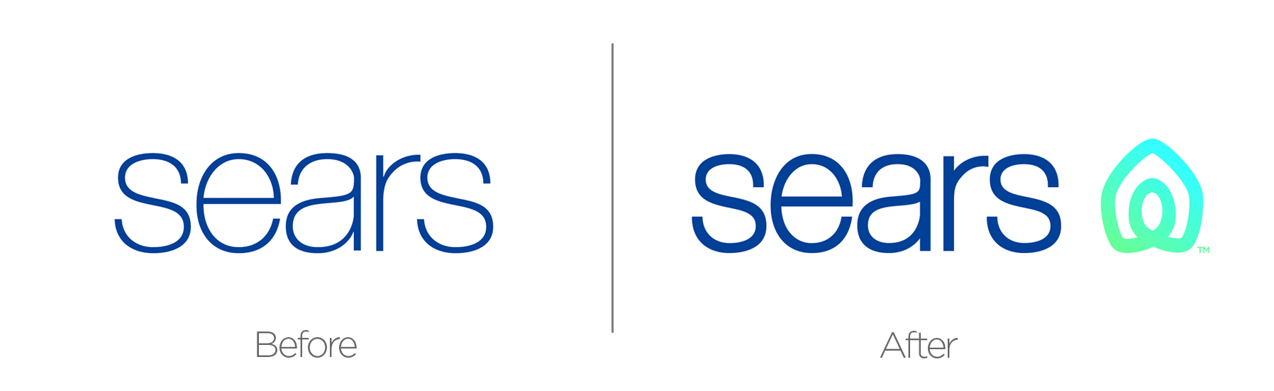
Here’s a script for you. In this scene, we see a bunch of executives discussing how to rebrand Sear’s in 2019. See if you can find the problem:
INT. CROWDED BOARDROOM
CEO: "Here's the deal. Our holdings flatlined in 2006 and began on a 10-year-cataclysmic nosedive in 2010. Does anyone have any ideas how to fix this?"
VP OF BRANDING: "...We could add a rocket ship icon next to our logo?"
CEO: "Approved."
EXT. BOARDROOM CELEBRATES
… Pretty obvious what’s wrong, right?
Key Takeaways:
- Superficial visual changes cannot compensate for fundamental business challenges
- Brand refreshes must align with meaningful operational improvements
- Rebranding should address market perception issues, not just visual fatigue
Tropicana
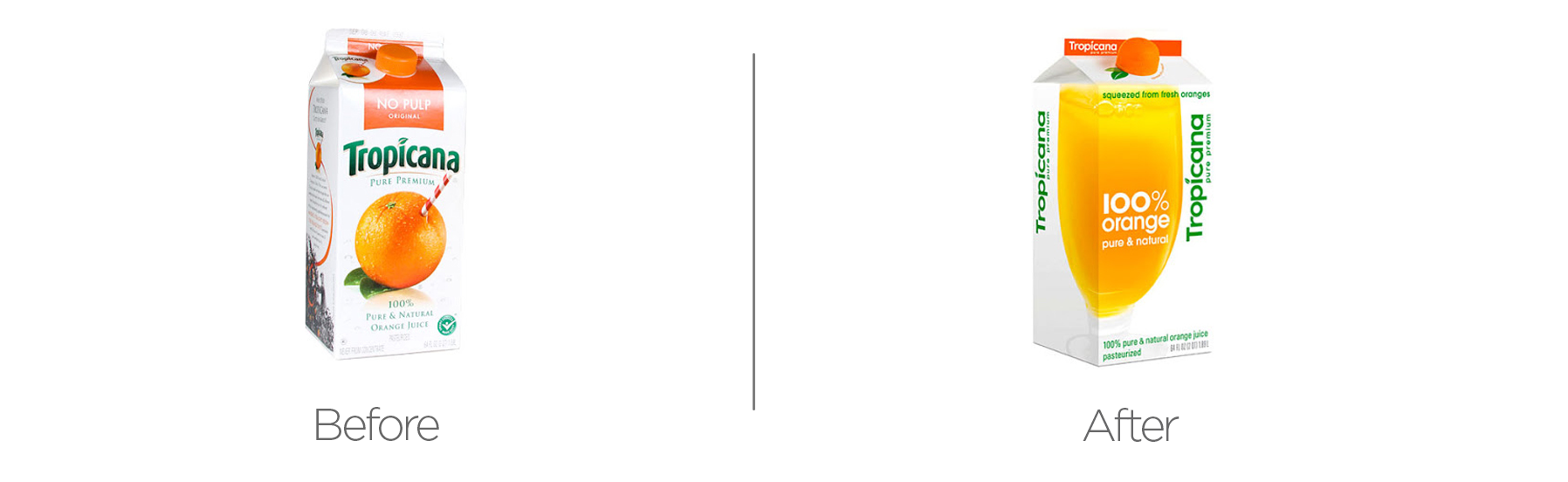
The late 2000s were a great time for rebranding. Social media was taking off, which meant there were new ways, both organic and paid, to get your new brand out there. However, the same was true back then as it is today — don't change just to change. Don't pivot just because you see others pivoting. While being "twitterpated" by the possibilities a new brand could bring, Tropicana dropped a lot of the character and personality that people had come to appreciate and enjoy.
This was something that millions of people saw sitting on their kitchen table every morning. So many people tried to jam a straw into an orange, allured by the promises on that carton - and now all of it was just... gone. In Tropicana's case, they learned VERY quickly that they shouldn't change. As it turns out, there is something that rhymes with orange. It's "20% drop in sales." A mere two months after the rebrand, PepsiCo switched back to the old packaging and ads.
Key Takeaways:
- Visual familiarity creates unconscious purchase decisions that shouldn't be disrupted
- Product packaging often carries more brand equity than companies realize
- Measurable business metrics should be the ultimate judge of rebrand success
But it’s a good thing they learned from their mistakes and didn’t do it again… right?
Pepsi

In 2008, Pepsi released arguably the most overwrought branding document of all time. This is a 27-page document. It endeavors to connect the logo to the Vāstu Śāstra and Pythagorean celestial music. It attempts to reconcile the relativity of time and space and the logo’s gravitational pull. To say the document is grandiose is an understatement.
But in 2023, Pepsi course-corrected. So why isn’t this in “The Good” section? Because it was 27 pages and it talked about the golden ratio like 4 times. It was 15 years and we were just supposed to be like “Yeah, that’s a brand guide for a real logo design.” There are other factors, of course, but you can look at a chart of market share and see Pepsi’s descent begin right around 2008.
Key Takeaways:
- Brand storytelling shouldn’t require a star chart.
- Inconsistent branding leads to trust erosion.
- Flashy doesn’t always mean effective.
Johnson & Johnson

Johnson and Johnson’s iconic script used since 1887 was replaced in 2023 with a clinical sans-serif. While easier to read than cursive, sans-serif is not at all indicative of the brand’s image. So what was their motivation? Well, that’s simple: YOUTHS!
Cursive has become borderline illegible for today’s youth as most schools have phased it out. However, limitations on legibility actually provide positive results for brands, like better memorability and better engagement. While outdated for most everyday usage, cursive still serves an effective purpose of brand recognition.
Key Takeaways:
- Legibility shouldn’t come at the expense of brand warmth.
- Longstanding identity elements carry psychological weight.
- Brand decisions should consider both function and feeling.
DISHONORABLE MENTIONS:
Applying These Rebranding Lessons to Your B2B Marketing Strategy:
Before assessing what rebranding strategy you need to take for your company, here are five questions you should ask first:
- What specific business outcomes are we hoping to achieve with this rebrand?
- Which elements of our current brand carry the most equity with our target personas?
- How will we measure the success of our rebrand beyond subjective aesthetic opinions?
- Does our rebrand align with our long-term market positioning strategy?
- Have we tested these concepts with current clients and prospects before full implementation?
These branding cases, both good and bad, illuminate how strategic brand evolution affects both aesthetic appeal and market perception—critical considerations for any B2B lead generation strategy. Developing a solid growth strategy framework like SOAR that integrates branding considerations with lead generation goals is crucial for any business looking to evolve its image successfully.
Transform your brand from a visual asset into a lead generation engine. Click here to learn how our SOAR marketing system integrates strategic rebranding with your B2B growth objectives.


Let Us Know What You Thought about this Post.
Put your Comment Below.