Guest blog by Leighton Cordell, Little Bird Marketing Designer
Where does the time go? A fortnight ago we were standing in the Little Bird break room, discussing documentaries, and I mentioned that the Helvetica documentary was one of my favorites. Priscilla asked what I liked about it, and literally the only thing I could remember was the Freitag bags sequence. Imagine my surprise in realizing that 2017 is the ten-year anniversary of the documentary’s release!
You guys - it could not have been ten years since Helvetica was released. That’s impossible. The only reason I could prepare to accept this passage of time is that it means my memory isn’t that terrible; I couldn’t remember the movie because I’ve had enough time to raise a fourth-grader since I first cast my eyes upon it. Anyhow, I re-watched it last week and it’s still brilliant, but different things stuck out to me this time because a lot of stuff has changed in the chasm between!

Today, I want to tell you why the movie is still relevant, and address some of the things that struck me on the ten-year anniversary of my first viewing. Oh, and for the record, the Freitag bag sequence is still great. Before we go too far, Helvetica is a documentary about a typeface of the same name that was designed by Max Miedinger and Eduard Hoffman in 1957. It quickly became popular, and frequently used, and currently is widely considered to be the most popular typeface in the world.
There are a lot of people who think that the world doesn’t need any more typefaces.
I have met some of them. They exist everywhere. And that’s fine. You know how subjectivity works. There will always be someone who looks at an abstract painting and claims it isn’t art, and there will always be someone who says new musicians should stop making music because it’s not as good as what Bach (or insert any genius composer) was doing. These things are okay, because they’re unchangeable.

Helvetica, the documentary, is interesting, because it uses the creation of Helvetica, the typeface, as a reference point in this debate. It’s important, because many designers consider Helvetica to be the super-saiyan of typefaces; big, uber-famous designers, like Massimo Vignelli. Mr. Vignelli (1931-2014) speaks at length during the film, discussing his opinion on typography.
“What Helvetica is, is a typeface that was generated by desire of having better legibility. It is a modern type. It is a very clear type. It’s good for everything, pretty much.”
Vignelli, by the way, was a brilliant designer who is responsible for iconic logos of American Airlines and Knoll, and the revered 1972 New York City Subway map. (All three examples use Helvetica.) He was not a fan of expressive type. In the film, he says that most typefaces are “bad,” and that he only sees the need for three (or so).

Legendary designer and Total Design founder Wim Crouwel doesn’t say it in the same words, but echoes the sentiment:
“We were impressed by it, because it was more neutral. And neutral was a word that we loved. It should be neutral. It shouldn’t have a meaning in itself. The meaning is in the content of the text, and not in the typeface itself.”
The film also interviews the opposition, like Jonathan Hoefler and Tobias Frere-Jones. In 2007, Hoefler & Frere-Jones were a hugely influential type design studio (they created Gotham, which you have definitely seen if you have watched a TV, looked at a computer, or seen any sign since 2002.) They parted ways dramatically in 2014 with a $20 million lawsuit over ownership of their collaborative creative design, but they both still design type.

Says Hoefler of Helvetica-
“The fact that it’s been so heavily licensed and made available through these very populous technologies has kind of furthered the mythology that it’s the ultimate typeface in some way. And even for us professionals, that’s hard to escape from. I sort of find myself buying the idea that the sans-serif evolved for a hundred years and the ultimate expression was Helvetica.”
Of course, in the world of type designers, you wouldn’t expect to find anyone who believes the work is done, and that’s why the best arguments for continued creation of new designs emerge from typographers.

Says Frere-Jones of Helvetica-
“The classical-modernist line on how aware a reader should be of a typeface is that they shouldn’t be aware of it at all…that it should be this crystal goblet just there to hold and display and organize the information. I don’t think it’s really quite as simple as that. Even if they’re not consciously aware of the typeface they’re reading, they’ll certainly be affected by it. The same way that an actor that’s miscast in a role will affect someone’s experience of the movie or play that they’re watching- they’ll still follow the plot, but be less convinced or affected. I think typography is similar to that. A designer choosing typefaces is essentially a casting director.”
Talking about type
It’s funny enough that Tobias Frere-Jones describes the choice of typeface like choosing an actor. This part of the movie comes right after Hoefler and Frere-Jones laugh together about how they have to resort to metaphorical vernacular to discuss type. It’s almost like the technical words don’t convey design effectively.

Last year, I read what I consider to be the winning argument on the topic of new font creation. It was written by Kris Sowersby, of New Zealand's Klim Type Foundry, and also relies on metaphor - comparing typography to cooking.
“Our relationship to typography is like our relationship to food–we eat for pleasure, not simply for nutrition.”
Like sand through the hourglass...
The final issue I’ll address from the film is the evolution of medium. Let me remind you, this was 2007…The same 2007 when the iPhone was initially released. Remember when iPhones didn't exist? It was the year before this film came out. Consequently, they talk about MySpace. What they’re actually talking about is social networking, and typography designed for screen use. Again, there is no correct answer about whether Helvetica is the “best” for screens - but there are people willing to swear on both sides. Since the film was released, Facebook happened. (Technically, it existed in ’07, but it had just opened availability outside of college students at the end of ’06. Did you forget about that ‘school kids only’ thing?) We have seen an upsurge in type designed specifically for use on screens. Nay, not just computer screens - phone screens. Watch screens. We have seen a surge of type designed for single uses, like coding. We have even seen a designer set out to improve Helvetica, whose resulting 90 family typeface is available through Adobe Typekit.
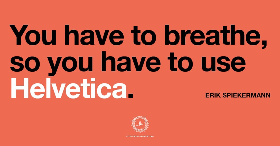
If you’re not into typography, I’m sure this is extremely boring. At Little Bird, typography is a huge part of what we do. In logo design and branding implementation, an elevated level of importance is placed upon type, for legibility and because the sentiment of the type is supposed to compliment the customer. Yes - different typefaces can carry different inherent sentiments. We also love the history of type. If the tornado hadn’t taken them away from me, Helvetica: Homage to a Typeface and Swiss Graphic Design would both be sitting in my desk shelf. In short, Helvetica is awesome, and we use it here - but not exclusively. It’s just one of the ingredients, to borrow a sentiment. Or, as Erik Spiekermann said, “It’s ubiquitous. It’s default. It’s air. It’s just there. There’s no choice. You have to breathe, so you have to use Helvetica.”
What do you think? Is type design still important, or has it all been done already? Are you looking forward to the revival of Papyrus? Let us know in the comments!
Want to work with us on your next branding project? Give us a shout, we'd love to talk!


Let Us Know What You Thought about this Post.
Put your Comment Below.